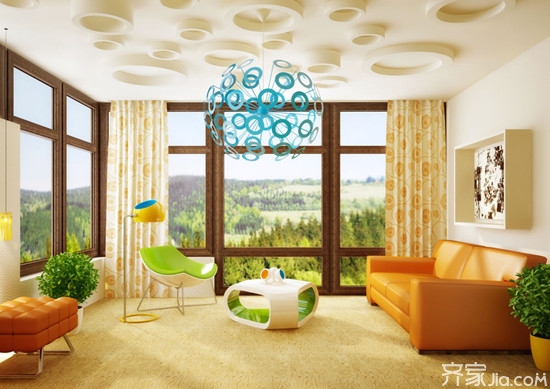
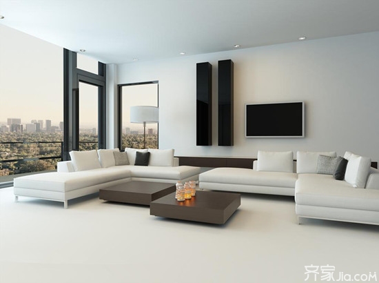
In addition to personal preference, color selection of home interior decoration mainly depends on the shape, use, and orientation of the room. The same wall, with a warmer color, feels a closer distance than a cool color, and the darker color appears to be receding compared to a lighter shade. Using this, using a cool color can make the ceiling feel higher and the room becomes wider. So to change the shape of the room, we can use the cool color to expand, with a darker color to shrink. Here we take a look at home interior decoration design color matching skills. Home interior decoration design color matching skills Home Interior Design Effect Picture First, the use of the room determines the atmosphere that space needs to create 1. The living room is a place where people stay longer. It should be bright, relaxed, warm, comfortable and suitable for rest. 2, the color of the restaurant should be conducive to increase appetite; the kitchen is suitable for light color, but be careful to use warm colors; 3. The corridors and halls are not strong enough to be used boldly for decoration and transition; 4. The color of the living room should be suitable for communication, and bright colors can be used to show the host's hospitality; 5. The use of color in the study should be easy to work, study and think. 6. The color of the children's room should be suitable for children's imagination and character cultivation. Home Interior Design Effect Picture Second, different orientation of the room with color choices are also particular about 1. The western rooms are hotter due to the strongest influence of the western sun. At this time, the use of cool colors can add comfort. 2. North-facing rooms have no direct sunlight, so color selection should be favored with color, and the color should be light, and dark colors can give people a feeling of boring; 3. The east-facing room is the first to be exposed to sunlight, which is also the earliest place where there is no light, so it is more appropriate to use light-warm colors; 4. South-facing rooms have a long duration of sunshine. The colors used should not be too bright. Use warm colors with caution, use cool colors to make people feel comfortable, and the effect is more charming. Home Interior Design Effect Picture Third, the color matching methods are various and varied. You can create any color effect according to personal preference and practical needs. There are the following five types of common: 1, youth imagination type: green, apricot, sky blue are the main colors of choice, while the choice of two to three complementary colors to each other, the color may wish more, you can paint the same color in the same wall or Small patterns cannot be too monotonous. 2, mature and stable: light gray and milky white is the most appropriate, the walls, ceilings and floors should be different shades of the same main color matching, but may wish to make a little bit of color jumps and transitions in the bottom line of the wall, beams and doors, In this way, it can show itself free and easy, without losing its taste. 3, elegant taste type: taste varies from person to person, because of the environment and different, so this type of paint should be particularly emphasized and the color of furniture accessories, a fabric sofa, a curved lamp, an Impressionist The paintings may affect the change of the whole color. It may be better to use the contrasting colors and similar colors at the same time. For example, similar colors are used on the side of the sofa, and the contrast between cold and warm colors is used on the side of the lamp to achieve an unexpected appearance. It is reasonable. Home Interior Design Effect Picture 4. Natural Harmony: The best way to combine with nature is to arrange the rooms in a simple way. Through the windows and hallways, the sunlight and air will be absorbed and circulated. Therefore, the paint color should be weak. Do not let the colors snatch the natural protagonists. You can choose There is a slight color change in the paint under different lighting, so that the rhythm of light can be recorded. 5, avant-garde strange type: the concept of avant-garde is changed according to the trend, the current avant-garde color combination is mainly focused on dissonance and restlessness, so in the color to choose a strong, simple, such as bright red, pure black, purple, etc. Do not lighten it with light colors. You can use an irregular pattern to render the atmosphere more intense. Conclusion: The use of different colors will create different decorative effects and styles. In general, cold colors can create a peaceful atmosphere; warm colors can give people a comfortable and warm feeling. Similar colors (such as red and yellow, blue and green) are more coordinated and unified; contrast colors (such as blue and green, green and red) are more unrestrained and emergent. Light tones can make room for expansion; dark tones give people a sense of being surrounded. Elegant colors give people a feeling of calm and leisure; bright colors are more lively. The above about the color matching of home interior decoration design is briefly introduced here, and I hope to help you. For more information, please visit this website. Stay tuned. Home Interior Decoration Interior Design Effect Picture
16 Channel DVR main features:
16ch 5MP @6fps Recording;
16 channel DVR Another name including:
Swann 16 Channel Dvr,Night Owl 16 Channel Dvr,Lorex 16 Channel Dvr,Security Camera Dvr 16 Channel
16 Channel DVR 16ch dvr 1080p,16ch dvr 5mp,16ch dvr kit,16ch dvr security system Shenzhen Sanan Technology CO.,LTD , https://www.sanan-cctv.com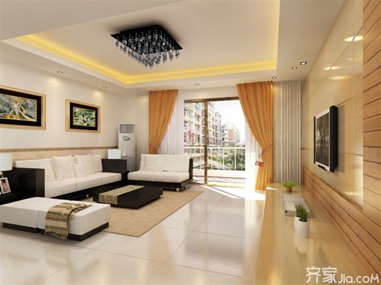

4ch*5MP@6fps Playback;
4ch Audio in / 1ch Audio out;
support: 2 x HDD,USBMouse,1ch CVBS,1ch VGA,1ch HDMI,4G & WIFI(The USB extension),Multi-Input(AHD.TVI.CVI.CVBS.IP);
Power adapter:DC12V/4A
Size:325(L)x220(W)x50(H)mm
